0
$\begingroup$

Consider independent random variates $X_0, X_1, . . .$ each uniformly distributed on the support $[0, 1)$

Let's say $Y = X_0 + X_1$, where $X_0$ and $X_1$ are independent uniform random variables with range $[0,1)$

I then derived the following PDF to describe the distribution of the sum $Y = X_0 + X_1$ using a convolution.

$$f(y) = \begin{cases} y & \text{for $0 < y < 1$} \\ 2-y & \text{for $1 \le y < 2$} \\ 0 & \text{otherwise.} \end{cases}$$

I want to check the derived distribution against a numerical calculation/histogram (in python)

Any help is appreciated

import numpy as np
import matplotlib.pyplot as plt

X_0 = np.random.uniform(0.0,1.0,1000)
X_1 = np.random.uniform(0.0,1.0,1000)

Y = X_0 + X_1

#Plot 3 normalised histograms
plt.hist(X_0,bins=100,density=True)
plt.hist(X_1,bins=100,density=True)
plt.hist(Y,bins=100,density=True)

#desired distribution
if 0<Y<1:
    F_Y = Y
if 1<=Y<2:
    F_Y = 2 - Y
if Y < 0:
    F_Y = 0
    
plt.plot(Y,F_Y)
plt.title('desired distibution')
plt.show()
$\endgroup$
2
  • $\begingroup$ The analytic result looks right; but for the numerics you should show at least some effort so that people can fix it up. That's for your own benefit, if this is your homework exercise or something like that you are not going to learn anything if other people do it for you. $\endgroup$ Commented Oct 20, 2020 at 17:12
  • $\begingroup$ @MaximUmansky I updated my question to show my most recent attempt. I don't think I am going about the coding correctly. I need direction as opposed to a solution. $\endgroup$
    – Student146
    Commented Oct 20, 2020 at 17:46

1 Answer 1

1
$\begingroup$

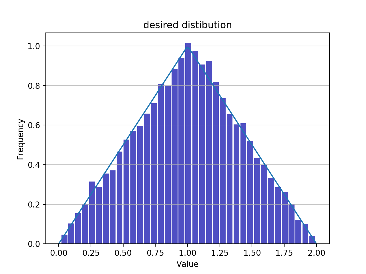
Here is a working code and the result shown below, just analyze it. Note that the probability density function $p(x)$ is normalized to unity, $\int p(x) dx$=1.

import numpy as np
import matplotlib.pyplot as plt

def show_histogram(vals):
    n, bins, patches = plt.hist(x=vals, bins='auto', density=True, color='#0504aa', alpha=0.7, rwidth=0.85)
    plt.grid(axis='y', alpha=0.75)
    plt.xlabel('Value')
    plt.ylabel('Frequency')
    plt.title('Distribution of calculated values')


X_0 = np.random.uniform(0.0,1.0,10000)
X_1 = np.random.uniform(0.0,1.0,10000)

Y = X_0 + X_1


#Plot normalised histograms
show_histogram(X_0+X_1)


#desired distribution
n=100
Y = 2*np.arange(n)/(n-1)
F_Y=1.0 - np.abs(Y-1)

    
plt.plot(Y,F_Y)
plt.title('desired distibution')
plt.show()

enter image description here

$\endgroup$

Your Answer

By clicking “Post Your Answer”, you agree to our terms of service and acknowledge you have read our privacy policy.

Not the answer you're looking for? Browse other questions tagged or ask your own question.