I'm trying to optimize an MPI application with a highly asynchronous communication pattern. Each rank has a list of things to compute, and sends messages as necessary if the inputs or outputs reside on a different rank. In addition, each rank is threaded (currently with one communication thread and 5 workers).
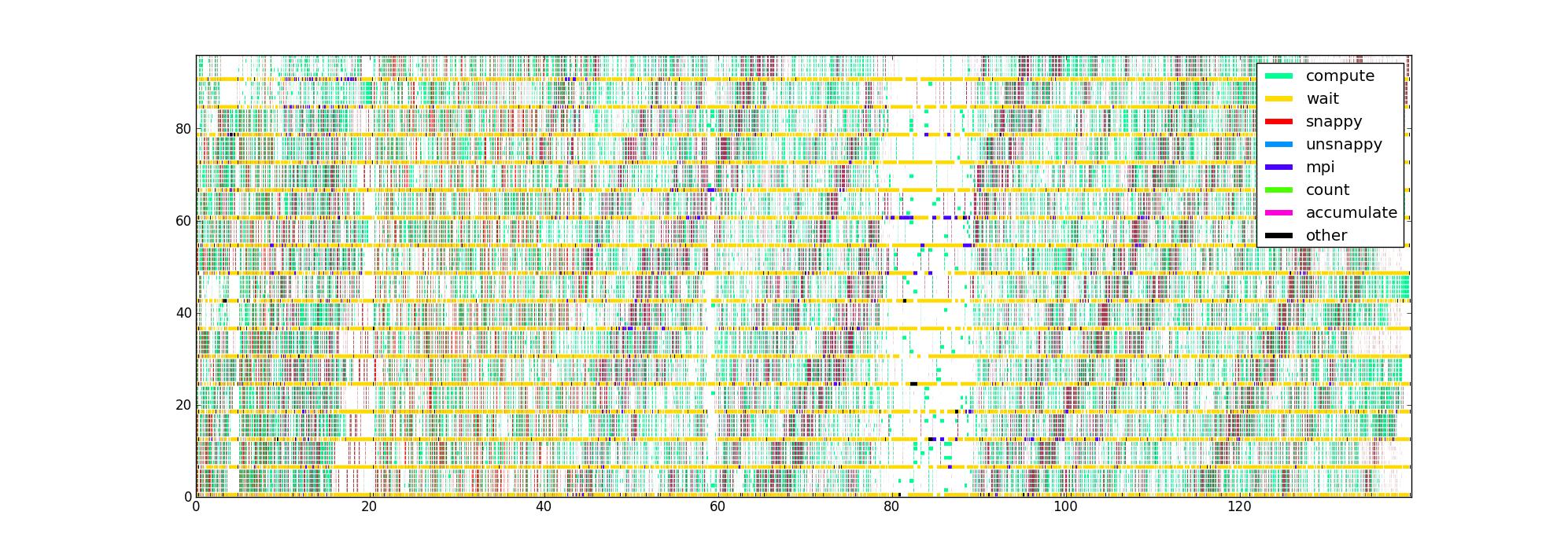
I've instrumented the code with timers around the different performance critical portions of code, which gives me a list of (start,end,type) triples for each thread. Plotted in the obvious way, with time as the horizontal axis, rank and thread as the vertical, and color indicating what each thread is currently doing, I get an image like this for 16 ranks with 6 threads/rank:

My question is: what are other ways of visualizing this data that might help pin down performance issues? Does anyone have a favorite type of plot they use when profiling asynchronous applications?
This data set is limited in that it doesn't know the dataflow structure, but I'd like to get as much insight out of it as possible before trying to collect something more complicated.
The uncompressed image is here in case anyone wants to look around (it failed to upload through the normal route). Unfortunately, Firefox doesn't accept it even though I believe it's valid, possibly because it's simply too large.