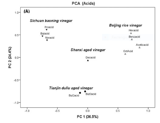
I've done some PCA on my own, and am familiar with the basic concepts of how PCA components are calculated and applied. However, I'm working on a research project and am confused as to how to interpret a common type of graph I've seen across many papers using SPME analysis of volatiles. None of the papers I'd read through elaborate on how to interpret these graphs specifically, and trying to find more information elsewhere just leads to general explanations of PCA interpretation, which isn't what I'm having trouble with.
Specifically, many researchers provide PCA graphs, where the points of the graph are labeled with specific compounds included in the analysis. For example, in an analysis of acids present in different vinegars the associated PCA chart has points labeled for each of those individual acids.
Should I interpret those labeled points as the location within the graph where that given compound would be at it's highest observed signal? So if some point at (0.75, -1.15) is labeled "but1one" that's where some hypothetical sample containing only but1one would appear?
