12
$\begingroup$

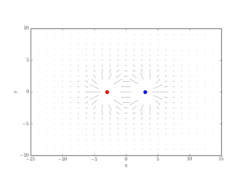
What is the best way to get a visual appealing plot of a singular vector field (if you want to visualize also the field strength). As an example I am playing with the electric fields of two point charges as in the following example:

from pylab import *
from scipy.integrate import odeint
from matplotlib import animation
from matplotlib import cm
import numpy as np

rc('font', **{'family': 'serif', 'serif': ['Computer Modern']})
rc('text', usetex=True)

## Set up charges

class charge:
    def __init__(self, q, pos):
        self.q=q
        self.pos=pos


chargesPlus=[]
chargesMinus=[]

#for i in arange(0,1,1):
chargesPlus.append(charge(1,[3,0]))
chargesMinus.append(charge(-1,[-3,0]))
charges = chargesPlus + chargesMinus


def E_point_charge(q, a, x, y,r):
    return q*(x-a[0])/((x-a[0])**2+(y-a[1])**2)**(1.5), \
        q*(y-a[1])/((x-a[0])**2+(y-a[1])**2)**(1.5)


def E_total(x, y, charges):
    Ex, Ey=0, 0
    for C in charges:
        E=E_point_charge(C.q, C.pos, x, y,1)
        Ex=Ex+E[0]
        Ey=Ey+E[1]
    return [Ex, Ey]


domain =2

## Cut Quiver plot
def cut(r):
    if r < domain:
        return 0
    else:
        return 1

cutv = np.vectorize(cut)


def cut_total(charges,x): 
    c = 1
    for C in charges: 
        r = sqrt((C.pos[0] - x[0])**2 + (C.pos[1] - x[1])**2)
        c = c*cutv(r)
        print c
        print C.pos[0],C.pos[1]
    return c

fig = figure()

ax = fig.add_subplot(1,1,1)


xMin,xMax=-15,15
yMin,yMax=-10,10

#ax.plot(x,y)
ax.axis('tight')
xlim([xMin,xMax])
ylim([yMin,yMax])


# plot point charges
for C in charges:
    if C.q>0:
        plot(C.pos[0], C.pos[1], 'bo', ms=8*sqrt(C.q))
    if C.q<0:
        plot(C.pos[0], C.pos[1], 'ro', ms=8*sqrt(-C.q))


xG,yG = meshgrid(linspace(xMin,xMax,25),linspace(yMin,yMax,25))

# plot vector field
E_totalX,E_totalY = E_total(xG,yG,charges)

EAbs = (E_totalX**2 + E_totalY**2)**(0.5)
E_XX = E_totalX/EAbs
E_YY = E_totalY/EAbs
#EAbs = np.nan_to_num(EAbs) 

#ax.streamplot(xG,yG,E_XX,E_YY,color=EAbs,cmap=cm.autumn)
ax.quiver(xG,yG,E_XX,E_YY,EAbs,cmap=cm.GnBu)

xlabel('x')
ylabel('y')
ax.set_aspect(1)


plt.savefig('fig1.png')

E_totalX = E_totalX*cut_total(charges,[xG,yG])
E_totalY = E_totalY*cut_total(charges,[xG,yG])

ax.cla()

# plot point charges
for C in charges:
    if C.q>0:
        plot(C.pos[0], C.pos[1], 'bo', ms=8*sqrt(C.q))
    if C.q<0:
        plot(C.pos[0], C.pos[1], 'ro', ms=8*sqrt(-C.q))


ax.quiver(xG,yG,E_totalX,E_totalY,pivot='middle',minshaft=0.1,minlength=0.3,headlength=2,headaxislength=2,headwidth=3,scale=4,alpha=0.4,width=0.002,linestyle='solid')

xlabel('x')
ylabel('y')
ax.set_aspect(1)

plt.savefig('fig2.png')
#show()

The output looks like follows:
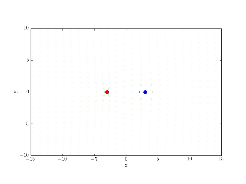
fig1

fig2

The problem with the first example is how to choose colormap. I played with different maps from http://matplotlib.org/examples/color/colormaps_reference.html but none gave me a really satisfying result.

The problem with the first example is the cut function which doesn't work automatically. You need to cut out a specific region manually.

So what would be your suggestions to improve those plots?

If you have alternative FOSS tools, which can do those plots better or easier please share it. Please don't share LaTeX solutions since I asked a corresponding question on TeX.sx of how to attack this problem with PsTricks or something like that: https://tex.stackexchange.com/questions/225176/visualize-singular-vector-fields-with-tikz-or-pstricks-and-friends

I think the question should be community wiki.

Edit Since especially the colormap part of the question is not answered yet, I add another simple example where the colormap doesn't look nice:

%matplotlib inline
from pylab import *

X=linspace(-2,2,40)
Y=linspace(-2,2,24)
X,Y=meshgrid(X, Y)


def E(x,y):
    r = sqrt(x**6 + y**6)
    return (x/r,y/r)

def E_dir(x,y):
    #direction field
    Ex,Ey=E(x,y)
    n=sqrt(Ex**2+Ey**2)
    return [Ex/n, Ey/n]

Ex,Ey = E(X,Y)
Exdir,Eydir = E_dir(X,Y)
EE=sqrt(Ex**2+Ex**2)
E
Q  = quiver(X,Y,Exdir,Eydir,EE,cmap='autumn')
show()

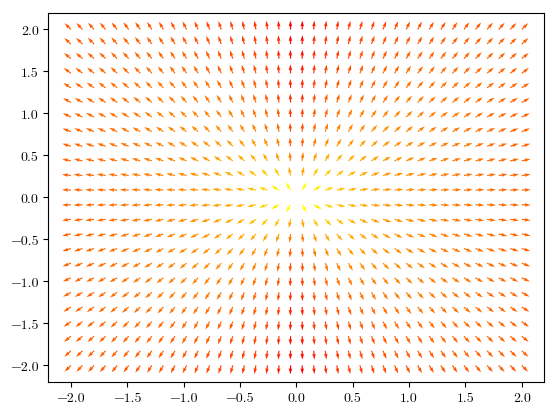
Almost everything of the picture just looks red.
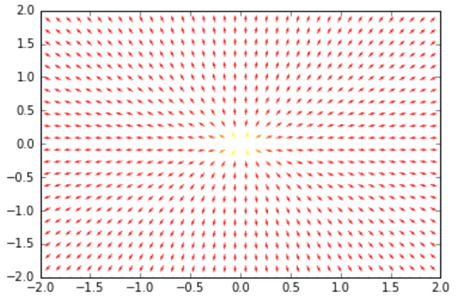
output

$\endgroup$
3
  • 1
    $\begingroup$ What about the script used to do some of the Wikipedia plots: VectorFieldPlot? Here is the link $\endgroup$
    – nicoguaro
    Commented Jan 28, 2015 at 5:59
  • 1
    $\begingroup$ @Julia, The second picture "looks red" because the values of the matrix EE you supply (that defines the color of the plot) drop exponentially fast to zero as you move away from the origin and are all plotted the same color. The issue is with the data you supply not with the colormap. $\endgroup$
    – Stelios
    Commented Jun 24, 2017 at 20:40
  • $\begingroup$ There is manim, a Python package used to create explanatory math, developed by 3Blue1Brown, who has many wonderful math videos. I don't know how to use manim so I can't provide a complete solution. $\endgroup$
    – Jason
    Commented Dec 28, 2020 at 12:52

4 Answers 4

8
+50
$\begingroup$

[I took your sample program as a starting point and adapted Colormap Normalization from the matplotlib wiki.]

Almost everything of the picture just looks red.
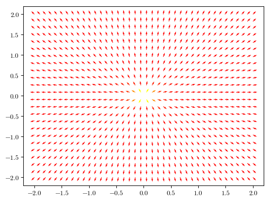
Indeed. They problem is that there is a very narrow divergence in your data and because the colormap is scaled linearly almost all of the plot will be mapped to the lower limit of the colorbar.

Q = quiver(X,Y,Exdir,Eydir,EE,cmap='autumn')

enter image description here

That means we need to rescale the colorbar. For a diveregence a logscale sounds good. First of all we need

import matplotlib.colors as colors

so we can mess with the colors. Next we simply put

Q = quiver(X,Y,Exdir,Eydir,EE,cmap='autumn',
           norm=colors.LogNorm(vmin=EE.min(),vmax=EE.max()))

This will scale the colorbar logarithmically.

enter image description here

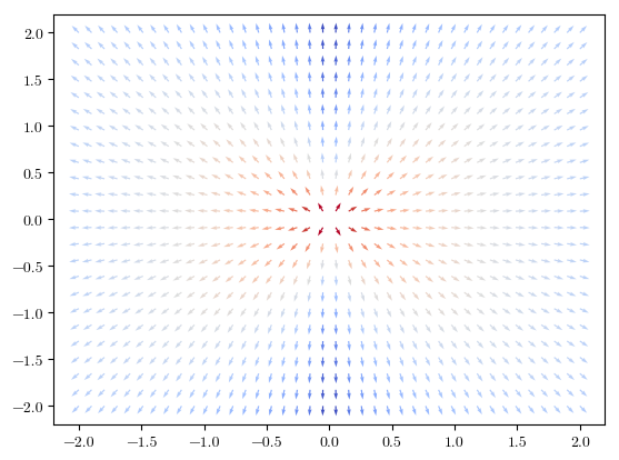
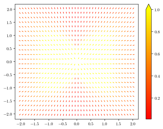
That looks a little better already. Now let's use another colormap because yellow is so hard to see. I think coolwarm looks okay and suits the diverging data (I think Paraview uses this by default).

Q = quiver(X,Y,Exdir,Eydir,EE,cmap='coolwarm',
           norm=colors.LogNorm(vmin=EE.min(),vmax=EE.max()))

enter image description here

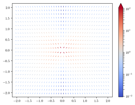
As a last step let's add a nice colorbar indicating the divergence.

fig = figure()
Q = quiver(X,Y,Exdir,Eydir,EE,cmap='coolwarm',
           norm=colors.LogNorm(vmin=EE.min(),vmax=EE.max()))
fig.colorbar(Q,extend='max')

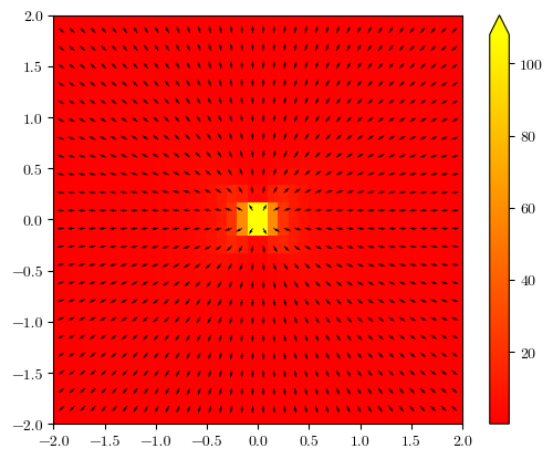
enter image description here

Of course you can also put a colormap in the background as in the MATLAB answer.

fig = figure()
I = imshow(EE,extent=[np.min(X),np.max(X),np.min(Y),np.max(Y)],cmap='autumn')
Q = quiver(X,Y,Exdir,Eydir)
fig.colorbar(I,extend='max')

enter image description here

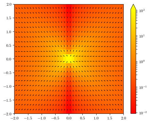
or log scaled

fig = figure()
I = imshow(EE,extent=[np.min(X),np.max(X),np.min(Y),np.max(Y)],cmap='autumn',
           norm=colors.LogNorm(vmin=EE.min(),vmax=EE.max()))
Q = quiver(X,Y,Exdir,Eydir)
fig.colorbar(I,extend='max')

enter image description here

Another method is to clip the data to a maximum value. The imshow command can do this on its own using the vmax key, for quiver you have to do it manually using numpy.clip. This sets all values outside of a certain threshold to that threshold.

numpy.clip(a, a_min, a_max, out=None)

But because your function is changing so rapidly you probably have to use a logarithmic colormap in this case as well.

fig = figure()
Q = quiver(X,Y,Exdir,Eydir,clip(EE,None,1),cmap='autumn')
fig.colorbar(Q,extend='max')

enter image description here

$\endgroup$
3
$\begingroup$

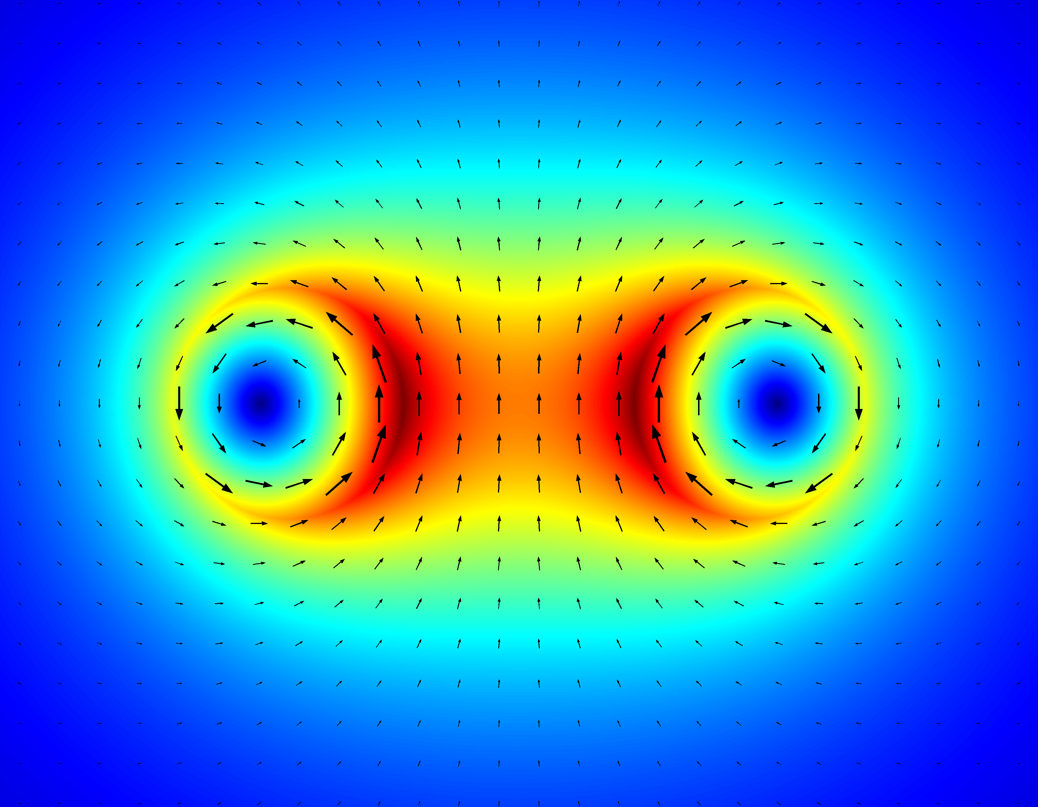
I have some simple Matlab codes that plot little arrows for the vectors. I then use a color map to indicate intensity underneath. I think they look pretty cool.

Wires

Here is an example of the quiver plotter function. It generates the vertices for the quiver/arrow, which you can then draw using the fill() function.

%   INPUTS:
%       U,V = Quiver x- and y-components.
%       X,Y = x- and y-position of the center of the quiver stem.
%
%   OUTPUTS:
%       Xv,Yv = Quiver vertices.

function [Xv, Yv] = quiver_vertices(U,V,X,Y)

%  Magnitude of vector.
MAG = sqrt(U.^2 + V.^2);

%  Quiver stem half-thickness.
T = MAG/40;

%  Arrowhead thickness.
AH  = MAG/3;            %  Height
AHx = AH/3;             %  Width

%  Solve for angle of quiver relative to x-axis.
THETA = atan2(V,U);
sinT  = sin(THETA);
cosT  = cos(THETA);

%  Solve for tips of quiver stem.
Xa = X + U/2 - AH*cosT;
Xb = X - U/2;
Ya = Y + V/2 - AH*sinT;
Yb = Y - V/2;

%  Solve for quiver arrowhead vertices.
PHI = pi/2 - THETA;
Xt1 = X + U/2;
Yt1 = Y + V/2;
Xt2 = Xa + AHx*cos(PHI);
Yt2 = Ya - AHx*sin(PHI);
Xt3 = Xa - AHx*cos(PHI);
Yt3 = Ya + AHx*sin(PHI);

%  Solve for vertices of quiver stem.
Xa1 = Xa - T*sinT;
Xa2 = Xa + T*sinT;
Xb1 = Xb - T*sinT;
Xb2 = Xb + T*sinT;
Ya1 = Ya + T*cosT;
Ya2 = Ya - T*cosT;
Yb1 = Yb + T*cosT;
Yb2 = Yb - T*cosT;

%  Fill the quiver vertices.
Xv = [Xt1 Xt2 Xa2 Xb2 Xb1 Xa1 Xt3 Xt1];
Yv = [Yt1 Yt2 Ya2 Yb2 Yb1 Ya1 Yt3 Yt1];
$\endgroup$
3
  • 1
    $\begingroup$ Nice picture. Can you share your source code? Though matlab is not free software, one might be able to translate this to free software tools, if one has the source code. By the way: The vector field doesn't seem singular to me. $\endgroup$
    – Julia
    Commented Jan 30, 2015 at 11:22
  • $\begingroup$ Hi Julia. My original post was from work and so I didn't have access to the code at the time. Now I've added the source code for you to look at. $\endgroup$ Commented Jan 31, 2015 at 16:15
  • 1
    $\begingroup$ @JamesNagel, I paste your code on a m file. But how to run it? When I run it on Matlab I get ??? Input argument "U" is undefined. $\endgroup$
    – Sigur
    Commented Jun 24, 2016 at 2:48
3
$\begingroup$

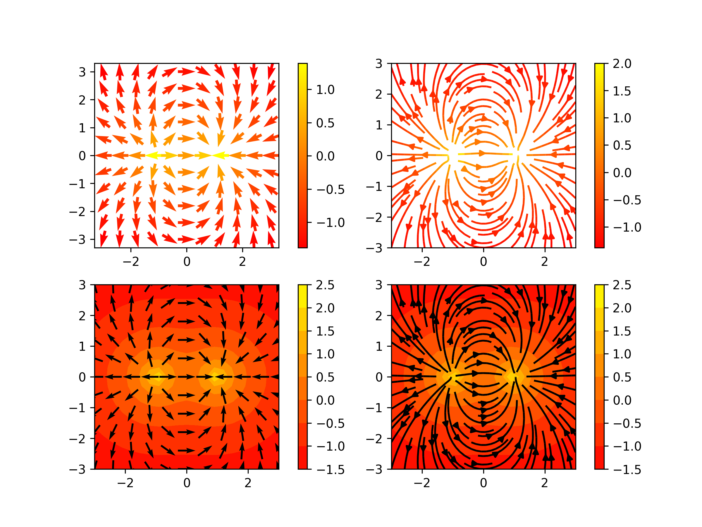
As already mentioned, the main problem is not with the visualization algorithm but with the data. Hence, you should use a different scaling (normalization) for the values. Furthermore, if you want to color glyphs (arrows, in this case) they should be of a size that allow them to have aesthetic values (like color). Then, I have modified slightly the answers provided before to show the colormap/vector direction field.

I also added another option for the visualization of your vector field: streamplots. Besides that, my answer is just a summary of what people already mentioned.

See my code below.

from __future__ import division, print_function
import numpy as np
import matplotlib.pyplot as plt


def elec_field(x, y, x_coords=[0], y_coords=[0], charges=[1]):
    Ex = np.zeros_like(x)
    Ey = np.zeros_like(x)
    for x0, y0, q in zip(x_coords, y_coords, charges):
        R = np.sqrt((x - x0)**2 + (y - y0)**2) + 1e-6
        Ex += q*(x - x0)/R**3
        Ey += q*(y - y0)/R**3
    return Ex, Ey


y, x = np.mgrid[-3:3:21j, -3:3:21j]
Ex, Ey = elec_field(x, y, x_coords=[-1, 1], y_coords=[0,0],
                    charges=[1, -1])
Emag = np.sqrt(Ex**2 + Ey**2)
dir_x = Ex/Emag
dir_y = Ey/Emag

plt.figure(figsize=(8, 6))
plt.subplot(221)
plt.quiver(x[::2, ::2], y[::2, ::2], dir_x[::2, ::2], dir_y[::2, ::2],
           np.log10(Emag[::2, ::2]), cmap="autumn", scale_units="inches",
           scale=5, width=0.015, pivot="mid")
plt.colorbar()
plt.axis("image")

plt.subplot(222)
plt.streamplot(x, y, Ex, Ey, color=np.log10(Emag),cmap="autumn")
plt.colorbar()
plt.axis("image")


plt.subplot(223)
plt.contourf(x, y, np.log10(Emag), cmap="autumn")
plt.colorbar()
plt.quiver(x[::2, ::2], y[::2, ::2], dir_x[::2, ::2], dir_y[::2, ::2],
           scale_units="inches", scale=5, width=0.010, pivot="mid")
plt.axis("image")


plt.subplot(224)
plt.contourf(x, y, np.log10(Emag), cmap="autumn")
plt.colorbar()
plt.streamplot(x, y, Ex/Emag, Ey/Emag, color="black")
plt.axis("image")

plt.savefig("vector_field.png", dpi=300)
plt.show()

This is the result

enter image description here

$\endgroup$
1
$\begingroup$

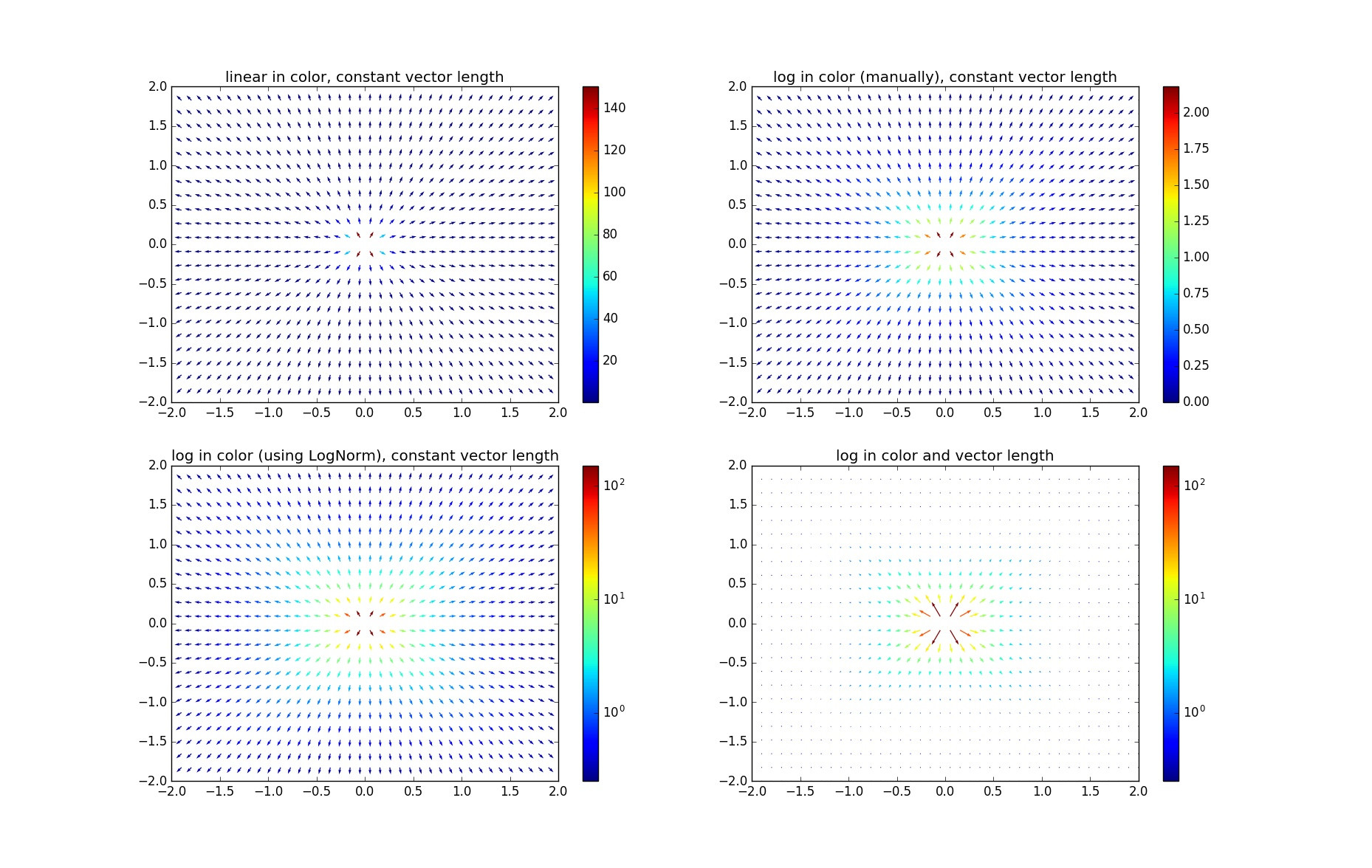
I think it makes sense to present your data in logarithmic scale for both color and vector length. Here's a code snippet based on your example.

from matplotlib.colors import LogNorm
from pylab import *

X=linspace(-2,2,40)
Y=linspace(-2,2,24)
X,Y=meshgrid(X, Y)


def E(x,y):
    r = sqrt(x**6 + y**6)
    return (x/r,y/r)

def E_dir(x,y):
#direction field
Ex,Ey=E(x,y)
n=sqrt(Ex**2+Ey**2)
return [Ex/n, Ey/n]

Ex,Ey = E(X,Y)
Exdir,Eydir = E_dir(X,Y)
EE=sqrt(Ex**2+Ey**2)
EElog=log10(EE-EE.min()+1.0)
Exlog=Exdir*EElog
Eylog=Eydir*EElog

colormap='jet'
# your way
ff=figure(1)
ff.clf()
subplot(221)
Q  = quiver(X,Y,Exdir,Eydir,EE,cmap=colormap)
colorbar()
title('linear in color, constant vector length')

# log colormap
subplot(222)
Q  = quiver(X,Y,Exdir,Eydir,EElog,cmap=colormap)
colorbar()
title('log in color (manually), constant vector length')

# a fancier way of doing a log colormap
subplot(223)
Q  = quiver(X,Y,Exdir,Eydir,EE,norm=LogNorm(vmin=EE.min(),vmax=EE.max()),cmap=colormap)
colorbar()
title('log in color (using LogNorm), constant vector length')

# log colormap and vector lengths
subplot(224)
Q  = quiver(X,Y,Exlog,Eylog,EE,norm=LogNorm(vmin=EE.min(),vmax=EE.max()),cmap=colormap,scale=50)
colorbar()
title('log in color and vector length')

show()
  • The first plot is just a reproduction of yours, except I used a different color scale to accentuate the differences.
  • The second and third plots both use logarithm mappings of the colors, one done manually, one done via matplotlib.colors.LogNorm(). Note that they're not quite the same. I'm not sure the exact equation that LogNorm() uses. Also, the colorbar knows about the log scaling for the automatic way, but not for the manual way.
  • The last plot log scales both colors and vector magnitudes. It seems uncouth to apply a log scaling to the vector magnitudes, but it might be appropriate if it's clearly stated.

Four quiver plots demonstrating logarithmic color and vector scalings.

$\endgroup$

Your Answer

By clicking “Post Your Answer”, you agree to our terms of service and acknowledge you have read our privacy policy.

Not the answer you're looking for? Browse other questions tagged or ask your own question.