43
$\begingroup$

Which software provides a good workflow from simple plotting of a few datapoints up to the creation of publication level graphics with detailed styles, mathematical typesetting and "professional quality"?

This is a bit related to the question of David (What attributes make a figure professional quality?) but the focus is not on the attributes but on the software or general the workflow to get there. I have superficial experience with a number of programs, Gnuplot, Origin, Matplotlib, TikZ/PGFplot, Qtiplot but doing data analysis and nice figures at the same time seems rather hard to do.

Is there some software that allows this or should I just dig deeper in one of the packages?

Edit: My current workflow is a mix of different components, which more or less work together but in total it is not really efficient and I think this is typical for a number of scientists at an university lab. Typically it is a chain starting from the experiment to the publication like this:

  1. Get experimental data (usually in ASCII form, but with different layout, e.g. headers, comments, number of columns)
  2. Quick plot of the data to check whether nothing went wrong in Origin, Gnuplot or arcane plot program written 20 years ago.
  3. More detailed analysis of the data: subtracting background contributions, analysing dependencies and correlations, fitting with theoretical models. Many scientists use Origin for this task, some Matlab and Python/Scipy/Numpy usage is increasing.
  4. Creating professional figures, this involves adjusting to journal guidelines, mathematical typesetting and general editing. At the moment I use Origin for this but it has several drawbacks (just try to get a linewidth of exactly 0.5pt, it is not possible). For combining/polishing figures I mainly use Adobe Illustrator, as it can handle im-/export of PDF documents nicely but I would prefer not having to go through two steps for each diagram.

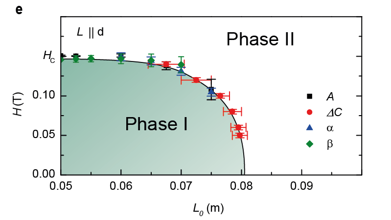
I added an example of how it might look like in the end (as this has been created mostly by hand changing anything is painful and anything that provides an interface for example to set the linewidth for all elements would be nice):enter image description here
$\endgroup$
2
  • 2
    $\begingroup$ Perhaps you should clarify your requirements. In its current form, the question is just attracting a big list of software. No one is describing in great detail what the advantages and disadvantages of the systems are. Looking at it, it wouldn't help me choose one. Of course all the technical computing software, MATLAB, Mathematiac, Maple, all the Python based solutions, R, etc. have many tools for creating plots. Then there are the GUI tools like Origin and xmgrace. Which one is the best choice depends on your needs. $\endgroup$
    – Szabolcs
    Commented Mar 16, 2012 at 7:12
  • $\begingroup$ @Szabolcs: I agree that my question is a bit broad. My workflow is not always the same, as I am analysing data from different experiments, therefore I tried to keep the question a bit more general. $\endgroup$
    – Alexander
    Commented Mar 16, 2012 at 10:51

14 Answers 14

34
$\begingroup$

If you have some experience with Python (or even not), I would recommend using the Python scientific software that is available (SciPy,Pandas),...) together with Matplotlib. Being a programming environment, you have full control over your data flows, data manipulations and plotting. You can also use the "full applications" Mayavi2 or Veusz.

$\endgroup$
5
  • 15
    $\begingroup$ +1 for Matplotlib. In addition to the points mentioned, the ability to use LaTeX in the text fields gives you the "mathematical typesetting" requested. $\endgroup$
    – Barron
    Commented Mar 15, 2012 at 14:00
  • $\begingroup$ any recommendation for enthought's chaco? $\endgroup$
    – pcr
    Commented Mar 20, 2012 at 5:14
  • 1
    $\begingroup$ Chaso is super awesome for interactive plots. A whole different animal IMHO. $\endgroup$
    – meawoppl
    Commented Mar 27, 2012 at 6:13
  • 2
    $\begingroup$ And for instant prettification of Matplotlib, check out seaborn. $\endgroup$ Commented Jan 10, 2014 at 7:56
  • 1
    $\begingroup$ Or prettyplotlib $\endgroup$
    – GertVdE
    Commented Jan 10, 2014 at 8:42
16
$\begingroup$

Based on what you're saying, a general purpose scripting language is probably your best bet, as long as it has some sort of graphing capability that you can access (whether built-in or imported).

In that vein, MATLAB will work, although you'll have to toy with line widths, symbols, and axes for presentation-quality plots. Given your criteria, I'd say the big weakness of MATLAB is detailed mathematical typesetting; MATLAB can use some TeX labels, but there are some LaTeX commands that it can't handle, so I remember having to go back and cut-and-paste some LaTeX labels from a PDF in Adobe Illustrator.

Python + NumPy will work for data imports, because numpy.loadtxt makes importing text data painless. At that point, you can choose between matplotlib and Gnuplot (which has a Python interface via Gnuplot.py; no active development on the interface since 2008, but then again, does Gnuplot change all that much anymore, even though it keeps adding releases?). MatthewEmmett's PyAsy wrapper could also work, depending on what you'd like to do. Matplotlib has great mathematical typesetting (as noted by Barron), and data manipulations can be done using NumPy, SciPy, or whatever other Python package you want to throw at your data.

The problem I had with gnuplot on its own is that it's really built for plotting only. It wasn't apparent to me how to manipulate data within the gnuplot scripting language. I essentially did all of my data manipulation in advance before I output it to text because I couldn't figure out how to do it otherwise. You can use gnuplot to evaluate formulas, and do some manipulations, but for me, Python has a lot more natural syntax, and is of greater general utility than gnuplot. I don't want to have to learn another language just to do one thing unless it's a really natural, easy-to-learn language. (Or unless I'm forced to.)

Tecplot 360 has a similar sort of issue. Tecplot 360 produces amazing plots, especially in 3D. There are things you can do with Tecplot 360 using a relatively easy-to-learn GUI that you'd probably be hard-pressed to do in another plotting package. The last time I used Tecplot was 6 or 7 years ago; apparently, they've added a lot of functionality since. Data manipulation can be done through indexing, slicing, or establishing zones. Derived quantities can be calculated using equations. You can also take the Fourier Transform of your data, perform interpolation (or kriging), and do a number of other things. It's not clear how to do mathematical typesetting. I guess you could hack HTML output from Tecplot and add MathJax or MathML? The disadvantages, in my mind, regarding Tecplot are that it's not free (which means that as a tool, you may not be able to take it with you from job to job), the iffy mathematical typesetting, and that scripting complex data manipulations requires learning Tecplot's macro language. The main advantage is that its 3D plotting capability outstrips matplotlib and MATLAB by a long shot. It's possible to batch plot data using Tecplot's macro/scripting language, and to call external Python scripts (with some limited functionality). Also, similar to MATLAB, there's a GUI you can fall back on if you don't want to learn Tecplot scripting. (Tecplot's GUI is a lot more full-featured than MATLAB's.)

LaTeX-based tools like TikZ and PGFPlots don't seem to be made for your use case. The weak point here is the data manipulation; TikZ and PGFPlots are great LaTeX tools. I wish I knew how to use them better. Since they're LaTeX, I'm guessing the workflow is cutting-and-pasting the necessary data into LaTeX and plotting it. It's possible to execute programs inside of LaTeX, but I don't see how that capability would necessarily help you, given that, for a presentation or document, the use case you're describing suggests that you're probably only going to keep the finished product. Maybe you're okay with that workflow; both tools have a reputation for being well-engineered and producing high-quality figures.

Finally, Adobe Illustrator is a fine tool for touching up plots, like you said; the deficiencies are also, like you said, lack of scriptability or repeatability, but nothing beats a graphics editing program if you want to make small tweaks.

$\endgroup$
1
  • 2
    $\begingroup$ I just want to add a small comment to this great answer. There is no need to use the Adobe product. The open-source tool inkscape will also give you great tools for touching up plots. In combination with the LaTeX plugin, it can do a fine job. $\endgroup$
    – Azrael3000
    Commented Apr 4, 2012 at 7:45
11
$\begingroup$

Another software package to consider is Asymptote. Asymptote is actually a programming language (with a C++ like syntax) that produces vector based output. One nice feature is that text is rendered with LaTeX (including math equations), so the text in your figures is consistent with your document.

I wrote a Python wrapper to Asymptote called PyAsy so that I could pass NumPy arrays to the Asymptote engine and do some basic plotting. It is fairly rough and not feature complete, but it might be helpful.

Anyway, the output quality of Asymptote is really nice.

Edit: Further to the above, I have found Fabric very helpful for launching remote jobs, syncing directories and building binaries, fetching run data and/or launching remote analysis scripts. It is a fairly lightweight Python library that makes running remote commands a bit easier (and scriptable).

$\endgroup$
11
$\begingroup$

I think this is an excellent question, and one that is at the forefront of my own mind right now. When reading most math-ish journals, Matlab seems to be acceptable, but it just doesn't measure up IMHO to some of the beautiful plots and diagrams that appear in journals like PNAS, Nature, PLoS ONE, etc.

After discussing exactly this issue in my research group for several weeks now, we have still come to no real conclusion on which package is best. We have found that most comparisons of graphics software in documentation, blogs or other web sources are largely useless in determining which package is best for a given purpose.

I think that what would really help the average user who is not an expert in all/many of these packages is to have a small set of very well-defined examples that could be used as a "graphical benchmark" of sorts (in a similar sense as CFD benchmarks). As far as I know, nothing like this currently exists.

At minimum, I would want to see:

  1. A reasonably straightforward 2D line plot with several line and point types, legend, math in labels/titles, etc.
  2. Ditto for a 3D surface plot.
  3. A more sophisticated 3D plot with isosurfaces, cutting planes, and perhaps some other fancy features.
  4. A fancy 3D diagram.

Data would be provided for #1-3, and a photo or "original" diagram for #4. For each example, code (input) and images (output) would be posted. This would allow the reader to more easily judge which package is right for them, both in terms of image quality and code complexity.

My plan is to do something like this in my group over the coming months for #1, 2, 4 and a small number of packages including Matlab, pgf/TikZ, python/scipy. If there is interest, I could post this publicly.

So while this is not an answer to the originally posted question yet (and I apologize for that) it could be an answer in several months' time.

$\endgroup$
3
  • $\begingroup$ Such a suggested benchmark is a nice idea. All of the suggested ways to reach the final diagram are hard to compare if you do not start from a given dataset and requirements. Additionally seeing the code in different languages/packages allows you to compare which is more suitable to your own needs. Especially with TikZ I have the impression that you can reproduce almost anything but that it might take a real expert to do so. $\endgroup$
    – Alexander
    Commented Mar 21, 2012 at 13:34
  • $\begingroup$ I think the benchmark is a good idea; I'd suggest for your 2D plots that you replicate some of the plots in the Matplotlib gallery. Sample code is already provided for each example. For 3D examples, Mayavi has a similar gallery in its documentation, and a nice 3D tutorial example. Replicating some of these 3D plots in other packages may also be useful. $\endgroup$ Commented Mar 21, 2012 at 14:53
  • $\begingroup$ What are you using now, some months later ? Any comments on creating plots by hacking (tinker with plot options in a text window, plot, loop ...) and/or interactively ? $\endgroup$
    – denis
    Commented Jun 13, 2015 at 15:04
9
$\begingroup$

I generally use gnuplot. It can be hard to learn, but it produces very clean plots. It can also be set to produce plots in encapsulated postscript format (.eps) which allows for easy embedding into documents written in $\LaTeX$.

$\endgroup$
1
  • $\begingroup$ +1 and for quick plots try qtiplot which is a nice origin clone and can do curve fitting as well. also for finaly layouts xfig is really nice (but hard) and can embed latex formulas directly with a bit of hacking into the details ... $\endgroup$
    – Karussell
    Commented Apr 3, 2012 at 20:34
8
$\begingroup$

Let me write a short review of Mathematica's graphics functionality, since that is what I'm familiar with.

What can it do?

To see some example, check out the Mathematica code gallery on the Wolfram site. It's not specifically about visualization, but almost all examples include some plotting.

You can also browse the plotting (basic) and graphics (more advanced) tags of Mathematica.SE

It is possible to create your example image in a fully automated way (no manual postprocessing needed).

Strengths

  • All graphics are specified in a declarative way (like SVG---you don't tell the system to draw something, you just list the vector graphics objects). Graphics are the same kind of Mathematica expressions as anything else in the system, they are just displayed in a special way. This means that graphics can be easily transformed and processed after they have been created---this applies to graphics made by plotting functions as well.

  • The quick and simple way to create graphics is using high level plotting functions, and setting lots of options to customize their output. If there is no function for the precise plot that you need, you can assemble the graphics from graphics primitives (which is also pretty easy).

  • Mathematical function plotting functionality is excellent. as far as I'm aware it's class leading. Mathematica samples functions adaptively (both in 2D and 3D) so a smooth plot can be generated quickly and automatically. Singularities, discontinuities, etc. are detected symbolically by plotting functions.

  • You can produce figures for a specific print size, and make sure that they fit well with the surrounding text in a publication (e.g. font size and styles match). In 2D, there are two kinds of coordinates: plot coordinates that correspond to your data and absolute coordinates specified in printer's points. The former scales when resizing the graphic, the latter doesn't. Text uses absolute coordinates by default which means that 8-point type will be 8 point regardless of whether the same figure is exported at 7 cm or 14 cm size. This makes it possible to have font sizes consistent with the text in the publication.

  • Builtin typesetting for mathematical formulae. The MaTeX third-party package provides LaTeX integration for excellent quality formula typesetting. (Disclosure: I'm the author.)

  • You can do all the data processing in the same system. Generally, with a bit of work, the full figure creation process can be automated (even some advanced aspects), avoiding the need for manual post processing in software like Adobe Illustrator. This is important when at the last minute you discover some minor problem and need to re-generate the figure.

Weaknesses

  • Having figures with several subplots and having some precise alignment between the coordinate systems of the subplots can be difficult.

    The SciDraw (third party) package fixes this and gives detailed control over every aspect of the figure. The tradeoff of this package is that it takes more effort to set up figures.

  • 3D graphics don't export well to vector formats. Exporting a bitmap version is fine though.

  • If your institution does not already have a license, it costs money.

$\endgroup$
6
$\begingroup$

Dig deeper into PGF plots:

1) can do 3d diagrams: python-matplotlib can't do them, gnuplot is ugly in comparison

2) has consistent fonts in size and family with the base document )

3) can be templated for specific colorschemes

There is nothing else like it on the market. :)

$\endgroup$
4
  • 1
    $\begingroup$ matplotlib has a 3d graphing utility. It is a bit weak, but certainly works fine for quick visualization. $\endgroup$
    – meawoppl
    Commented Mar 16, 2012 at 5:51
  • $\begingroup$ Definitely +1. When it comes to publication quality plots, nothing can beat it. Shameless plug: a question and my answers on pgfplots on TeX.sx: tex.stackexchange.com/search?q=user:9043+[pgfplots]. See also texample.net/tikz/examples/pgfplots for an example, and the very comprehensive manual. $\endgroup$
    – qubyte
    Commented Mar 27, 2012 at 2:50
  • $\begingroup$ With PGF-plots I only have the problem that you cannot assume publishers to support it. What would you do then if your workflow depends on it? I once ended up by first typesetting the figures and then including the resulting output to the main file which did not depend on PGF-plots anymore which was not really convenient. Is there a more clever way? $\endgroup$ Commented Jan 15, 2014 at 6:56
  • 1
    $\begingroup$ @ChristianWaluga: you can use the "standalone" class - this allows you to create PDF/EPS images using the PGF picture you already have prepared for the article. Then you can insert the PDF into the original article text with includegraphics. $\endgroup$
    – tmaric
    Commented Jan 20, 2014 at 10:10
5
$\begingroup$

If you already know TikZ, you might be interested in R and the tikzDevice; here is an example: tikzDevice - TikZ output from R, here is another example: TikZ diagrams with R: tikzDevice.

$\endgroup$
4
$\begingroup$

I find Tecplot to be quite powerful when it comes to data visualization and data manipulation.

$\endgroup$
1
  • 4
    $\begingroup$ What about Tecplot makes it very powerful? What features do you find particularly useful? $\endgroup$
    – Paul
    Commented Mar 16, 2012 at 14:29
4
$\begingroup$

I'll try to give you my view on my limited experience, which only covers a few type of plots: 2D data plots, scatterplots, and graph-based diagrams (trees and graphs, flowcharts); but first allow me to deviate from the question for a bit:

First, I would like to say that the importance of producing high quality plots is often overlooked. Plots are not only for displaying data but if used effectively they can communicate complex ideas which often can not be expressed clearly in text. It seems to me that this is not the appropriate place to discuss what constitutes, the benefits, and the disadvantages of a good plot but if interested look here.

Second, I have more often regretted using a half-baked plot than spending time on a high quality plot. The reason is that a bad plot can lie to you, for example, if using a half-baked plot for doing a quick look over data that you might have not properly normalized, or by using not-so-good plots to do visual comparisons (the eye can often be very forgiving or very misleading). So I would always recommend to prepare plots as if they were going to be shown to a person that is not familiar with the results. This can save you time and improve your work. Also, you have the added benefit that presentation material will be ready for the next presentation/seminar/paper.

Now to answer the question,

In my experience it is always better to separate the data processing from the actual plotting tool, and image manipulation tools. For data processing I use python as it is very flexible and I have not found a file format that cannot be easily handled through python. Moreover, the numpy and scipy libraries can be powerful manipulation tools for numerical data.

Within python I have not seen a plotting tool that gives you the control over all formatting details. I have found that it is the details that make a large difference when you try to integrate images while formatting a paper in latex. For instance, control of the whitespace and proportions of-and-around plots can be a headache with matplotlib (not impossible but not worth my time), this is very important if you have limited space as it is often the case in journal and conference papers.

In my experience, I have found that GNUPLOT is the best tool for formatting and producing 2D plots and scatterplots. It very much gives you control over all the details of your plot. And you can produce high quality plots (vector images) in black-and-white or colour. The high level of control makes GNUPLOT a bit more difficult to learn, and sometimes simple things can take a bit of work but if you start from an example it can simplify things. I usually look at this two sites for inspiration, see the not-so-FAQ site or the official demos here.

Sometimes, the plots produced by GNUPLOT can be quite large (in MB range) and the journal might reject the files (this happened to me with some very colourful scatterplots). I have used and I recommend Imagemagick, a command-line tool that allows you to convert, edit, and compress images (I used it to generate and edit high quality jpegs while significantly reducing the file size). I tried other tools that used automatic data compression, this proved specially problematic due to the delicate balance between image artifacts and compression.

I also have produced a fair share of diagrams (often for presentations). I found that if I'm going to use a diagram a single time (not a paper) then the Keynote application (OSX) and saving to pdf is good enough. However, when an image is used many times, the presentation quality is more important and TikZ is my preferred tool. I find TikZ a bit difficult to use but if you start from an example it is much more easy.

Finally, I do most of my work from the command-line so to integrate different tools I use with bash or python.

$\endgroup$
3
$\begingroup$

My quick vote is for QtiPlot.

Though it isn't perfect, it provides the best combination of GUI easiness, along with python scripting so what you're really doing then is "Qtiplot/Python/(Illustrator or Inkscape)". Qtiplot is extensible, so you can create your own scripts/macros which can run python commands to open and process data and then dump them into a table. You can then manually or automatically plot them. It is also possible to configure it to work with LaTeX typesetting with an internet available typesetter, or a local typesetter, so you can put math formulas in your plot titles/axes/markups.

The plots can then be exported to any format you want, but the format that works best is undoubtedly SVG. The SVG files can be touched up in inkscape if you want, which also has LaTeX typesetting abilities.

While MatPlotLib is great, its biggest draw-back is having to hand-code absolutely everything (just like any scripting plotting solution). QtiPlot is great because you can script/automate data processing and plotting all with great Python functionality, and then pass over a rough cut plot to a gui that will allow you to tweak it by hand and do all kinds of gui cutting/pasting/manipulating that is much faster on a case by case basis for data analysis. You can also set dimensions precisely with the scripting, and also manipulate the dimensions with the GUI, something you can't do with matplotlib.

I suppose it depends on how you feel about QtiPlot plotting solutions. I have found it to be very capable, but it is all a pretty steep learning curve.

$\endgroup$
3
$\begingroup$

I'm surprised nobody has mentioned Nico Schlömer's excellent tools matlab2tikz and matplotlib2tikz yet. If you are using LaTeX for document preparation and either Matlab or Python for data processing, you can easily get high quality vector plots which you can post process to your heart's content:

  1. Prepare your plots in Matlab or Python, including axes, labels, legends, etc. Don't worry about TeX formatting.
  2. Call matlab2tikz('figure.tex') (or matplotlib2tikz).
  3. Edit figure.tex to taste (replace label text with proper math, change colors, line width, legend placement, axis style, etc.), see the pgfplots manual (or the many questions on pgfplots on the TeX stackexchange).
  4. In your figure, instead of includegraphics, put \input{figure.tex} (and don't forget to include \usepackage{pgfplots} in the preamble).
  5. For submission, use the externalization library (see chapter 7 of the manual) to bake your figure into a pdf and simply replace \input{figure.tex} by \includegraphics{figure.pdf}.
$\endgroup$
2
$\begingroup$

If you are not looking for scripting take a look at MagicPlot. It's not so feature-rich as Origin (e.g. can produce only 2D plots) but I have never experienced problems with line width and other properties. Plots are nice anti-aliased though redrawing is fast enough. Plus useful fitting.

$\endgroup$
0
$\begingroup$

Tecplot 360 is good for processing large data and producing publication-quality plots. It has powerful add-on and scripting interfaces to process the data. It appears to me that it does everything you'd need for post-processing.

A common mistake is to resort to using Excel. No. It does not remember layout, X range, colour map. It does not animate. It uses ugly bulky spreadsheets to work with the data.

Of course you would not find a tool which does both post-processing and text editing, and choosing a reasonable text editor for your publications is another important question. Don't use MS Word, its citations manager is ugly. I use LyX or any other Latex tool available for the operating system I'm using.

Oh, and when you have to publish PDF, include a link to LaTeX, Word, or whatever format with readable math. In PDF, it's not.

$\endgroup$

Your Answer

By clicking “Post Your Answer”, you agree to our terms of service and acknowledge you have read our privacy policy.

Not the answer you're looking for? Browse other questions tagged or ask your own question.